Back in January, I did an email interview with California Newspaper Publishers Association that mostly talked about the how and why behind the reboots of the Orange County Register’s weekly/community newspapers.
It’s a super-long interview, so I won’t bother to post the whole thing. But from time-to-time, I will try to publish parts of it.
+++ === +++ === +++
How did you make sure to include local flavor in the look? And how much has gone into making one distinctive from the others?
Many of these papers have been tabloids with shared designs and similar flags for more than a decade. One of the things we did was spend a lot of time on the flags. A newspaper’s flag should represent its city and its people. It should feel like it’s the hometown newspaper. Yes, that sometimes can just be a font, but not for a newspaper that has undergone several flag changes over its lifetime.
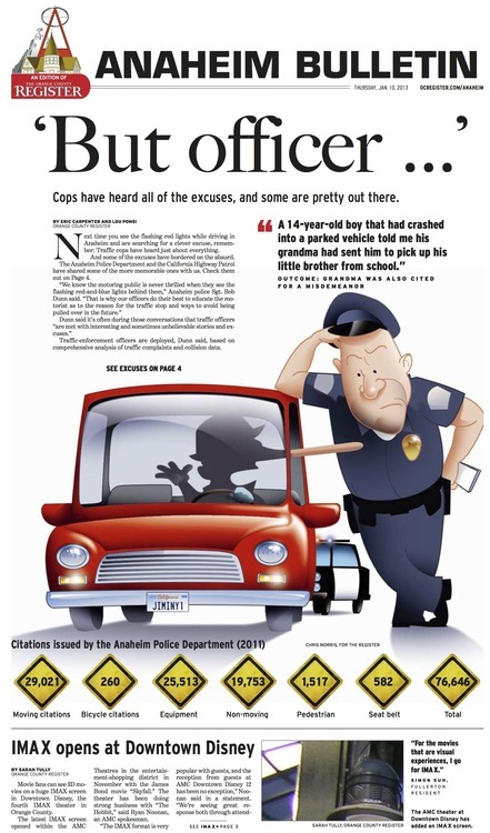
For the Anaheim Bulletin, we used a font very similar to what the paper used in its flag from the 1920s through the 1940s.

We then added imagery that was clearly iconic to the community.

For the Fullerton paper, we returned to the same font the paper used in the early 1900s. The problem was when that flag was used, the paper’s name was simply the Fullerton Tribune. That meant we had to create our own version of the word News.

Here’s a story about it:
http://www.ocregister.com/articles/paper-381136-news-tribune.html
We gave this much care to every paper’s flag – worrying about fonts, images, and even having custom illustrations created.
We were just as careful with what’s inside these papers. The 24 papers are basically split between five community editors and teams. There are certainly things that are shared by all the papers – like much more coverage of schools, churches and businesses – but each group also did things very specific to each newspaper.
The only thing cookie-cutter about these papers is that we used really, really good dough in each one of them.
===
20 remakes: It sounds like a redesign monster. Briefly describe the workflow just for the remake: How did the local editors feed that info back into the look?
We started with one prototype that had elements we thought would be fairly consistent in all of the papers – things like fonts and page folios, shorter stories, multiple points of entry, lots of engaging elements and information snippets – and lots of photos of people. But our biggest goal was to introduce a sense of fun, big designs, with lots of different narrative elements, and a way for our reporters and editors to steer clear of long text that basically scream to readers that they shouldn’t read this story.
In many ways we were combining old-school community stories with new-world design sensibilities. What if your local newspaper looked like it was designed in this decade and read like it was put together so that people couldn’t put it down once they picked it up?
Without going into exactly how we did it, we knew what our readers wanted and we did everything in our power to give it to them.


+++
You said: “It’s fun when a newspaper winks at its readers — a real sense of serendipity is important if you want folks to feel like they can’t wait to open your pages each week.” Describe how the sections will include that “wink” each week. (I’ve looked at some of the remakes online; my question pertains to keeping that “insider” feel consistently. What’s the directive to editor and reporter on that?)
It’s probably easier to send you examples of how we’re doing it. But let’s just say that we haven’t been afraid to poke fun at other cities within Orange County in certain newspapers. For a story on how to experience the five senses in Irvine, we had our cover illustration drawn to show Irvine as if it were an amusement park.
When you read these papers, you get a sense that there are real people producing them, not just some news droids with an AP style guide.