Dating back to our online team’s time in Lawrence, I’ve always had a nice friendship with John Temple. And shortly after our decision was made to come to Las Vegas to work with the Greenspun family of publications, John gave me lots of advice.
His advice that keeps proving to be correct time after time is that we should track and benchmark everything. About 15 or 16 months ago, I blogged about how we used that advice to keep tweaking our content strategy. By watching what our readers really do on our site — as opposed to what they might say in some formal reader survey — we continue to refine it nearly every day.
But we use benchmarking for more than just content decisions.
By my math — which, admittedly, completely sucks — the Sun’s homepage design/strategy has gone through roughly four fairly significant changes in the last couple of years.
When lasvegassun.com formally relaunched just over two years ago (under the direction and inspired leadership of Josh Williams, Doug Twyman and Dave Toplikar, along with lots of design love from Bill Gaspard and Tyson Evans), the site’s content closely mirrored the print edition of the Sun. I often describe that version of lasvegassun.com as similar to a very well done, regional version of Slate … not so much the news of the day, but more of what the news of the day meant, along with lots of interesting commentary and tidbits not typically found in a local newspaper.
Because that meant lasvegassun.com had a fairly low daily story count (think around 10 stories or so a day), the main content area of the homepage was essentially designed every day.
And it was a thing of beauty:
+++

+++
Here’s how that main content area would change from day-to-day:
+++

+++
After watching the traffic trends for a few months — including the realization that lasvegassun.com’s traffic numbers were actually going down a little after the removal of some national wire feeds that were being read by a small, but passionate national audience — it was decided the content from the Sun’s print edition was great on the web, but couldn’t be the only thing on the Sun’s website.
Seems kind of obvious now, huh?
At that point, local breaking news and other content created specifically for the web became a key part of lasvegassun.com’s strategy. With that additional content, the site’s traffic numbers began growing very quickly.
The problem was the site’s homepage and CMS templates weren’t really designed for that mission. To accommodate this, the site’s homepage design was essentially hacked. That meant the site had its great-looking print content (which was still being custom designed each day) on the homepage with breaking news headlines just stacked on top.
It looked like poop. It looked like this:
+++
+++
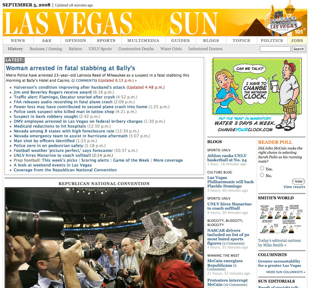
Around this same time (September of 2008), I was asked to speak at an SND conference. I explained this dilemma to the audience and that it looked like we were getting ready to benchmark whether “pretty or ugly” was more practical on the web.
I remember thinking at the time that “ugly” was going to win out because of the amazing traffic that some of the ugliest sites on the web got at that time — think DrudgeReport and you’ll know exactly what I’m talking about.
So our senior online news designer at the time, Tyson Evans, (who also had a very big hand in the design of the site the first time around) began building a tweaked homepage that would hold all of our breaking news.
It looked basically like this:
+++
+++
So, what was the effect on our traffic?
The numbers just kept growing. And because our marketing and better promotion within the Sun print edition really were starting to kick in, the numbers actually were growing fairly significantly.
The weird thing was that we all kind of missed how the old lasvegassun.com homepage would actually be redesigned each morning. The problem was that on top of our content from the print edition, we now were publishing somewhere between 20 and 40 locally produced online/breaking stories a day.
Some of those online-only stories had art. Most didn’t. Some stories were important. A lot were just “new” news, but definitely not huge news.
We certainly weren’t going to be able to custom design homepages with all of those variables.
But with the help of some very creative template implementation by our team’s current (and incredibly talented) senior designer Danny DeBelius, the problem not only was solved but also helped our traffic grow one more time.
The cool part about how Danny built our homepage templates is that our homepage design actually changes several times throughout the day, always looking fresh … and not just because of the newer stories.
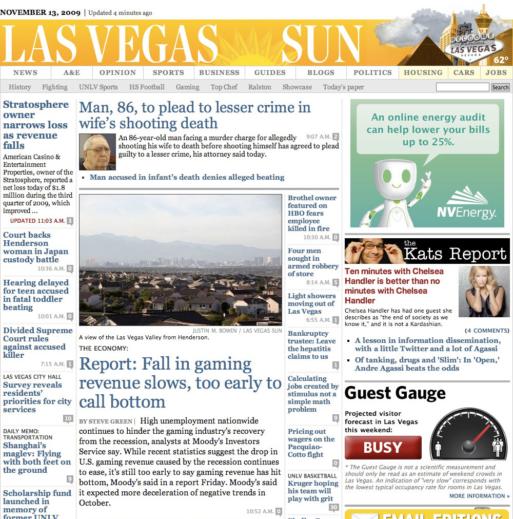
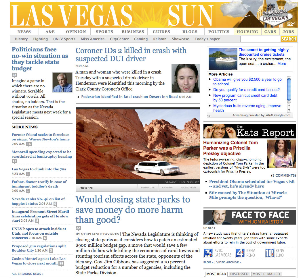
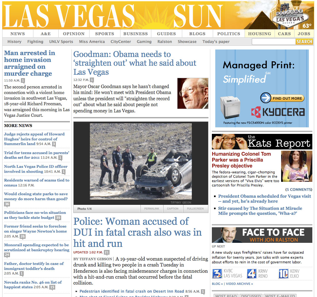
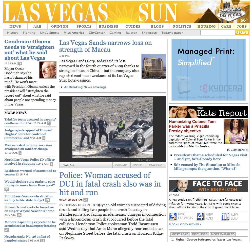
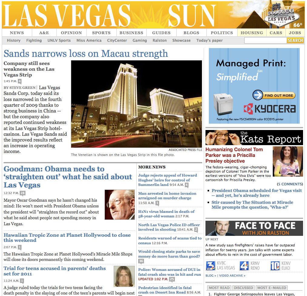
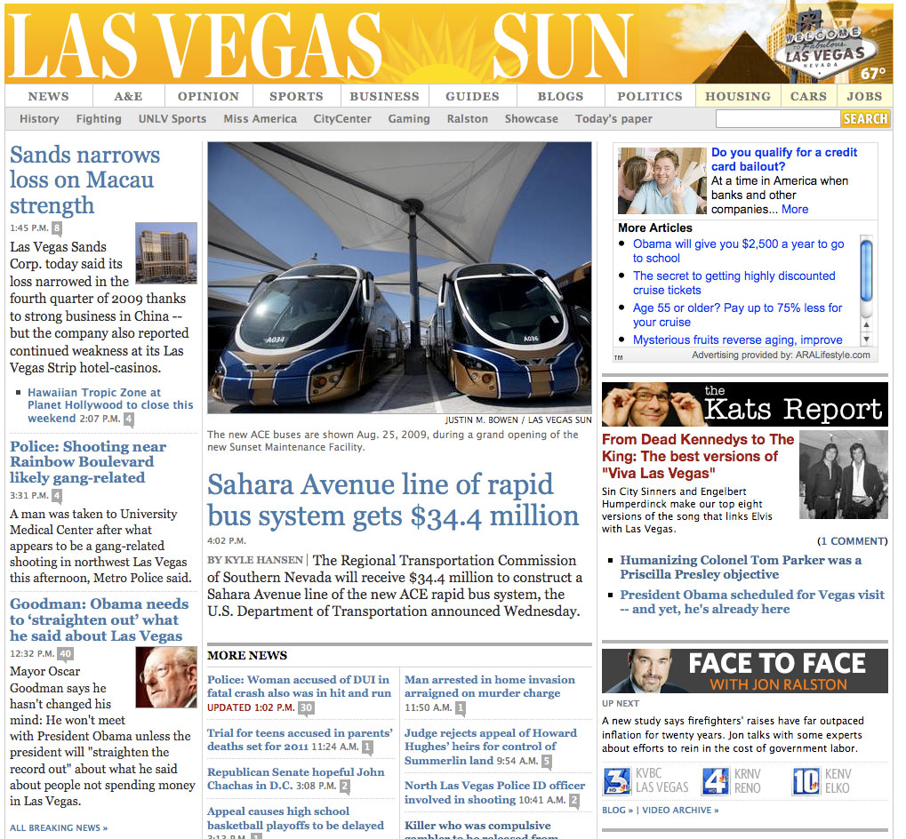
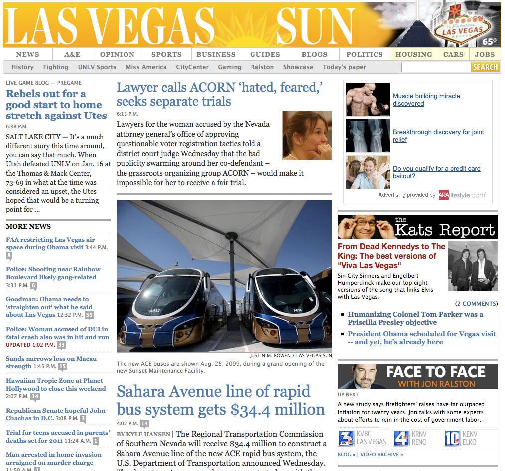
So, here’s a look at how our homepage looked on a recent day — for a 24-hour period beginning at 2 a.m.:
+++
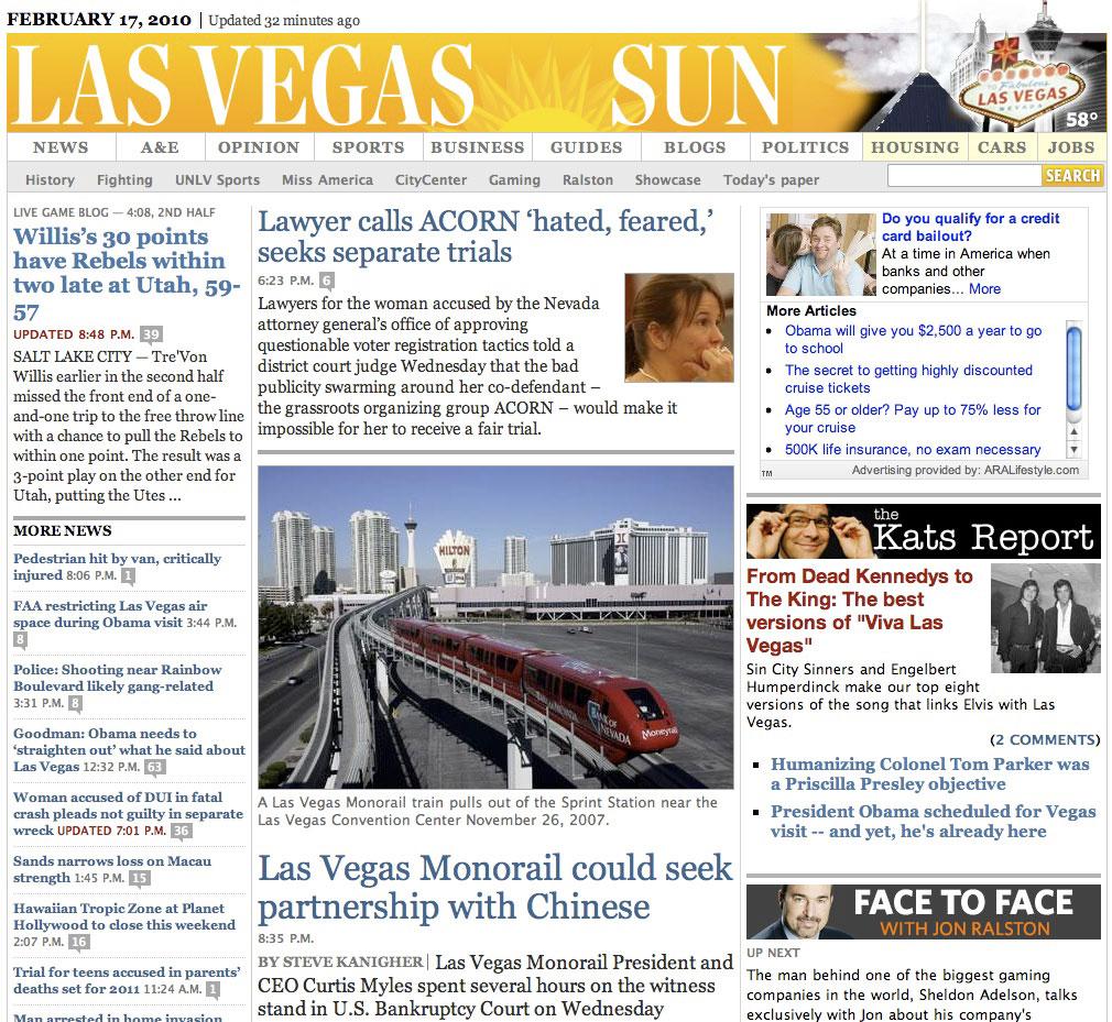
2 a.m., Feb. 17.

+++
8:40 a.m., Feb. 17.
+++
10 a.m., Feb. 17.

+++
11:30 a.m., Feb. 17.

+++
12:45 p.m., Feb. 17.
+++
1:45 p.m., Feb. 17.
+++
2:30 p.m., Feb. 17.
+++
4:05 p.m., Feb. 17.
+++
6:15 p.m., Feb. 17.
+++
8:50 p.m., Feb. 17.
+++
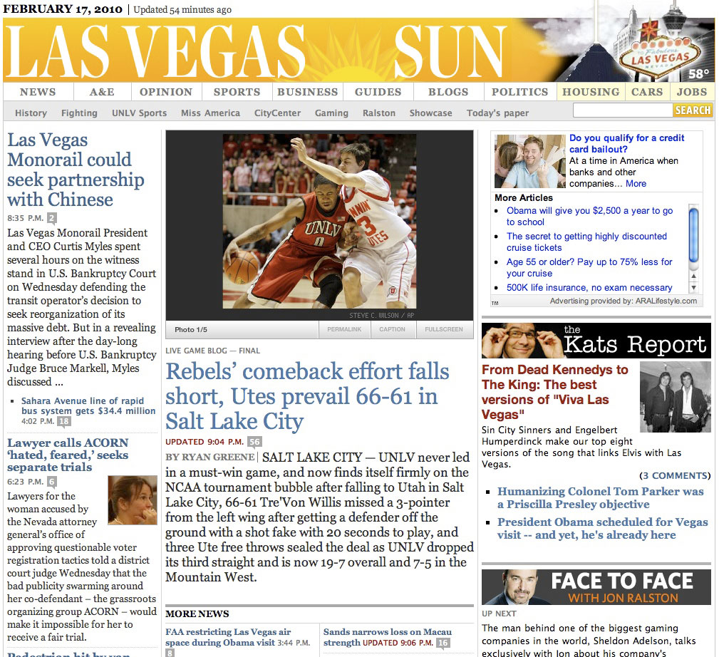
9:05 p.m., Feb. 17.
+++
9:35 p.m., Feb. 17.

+++
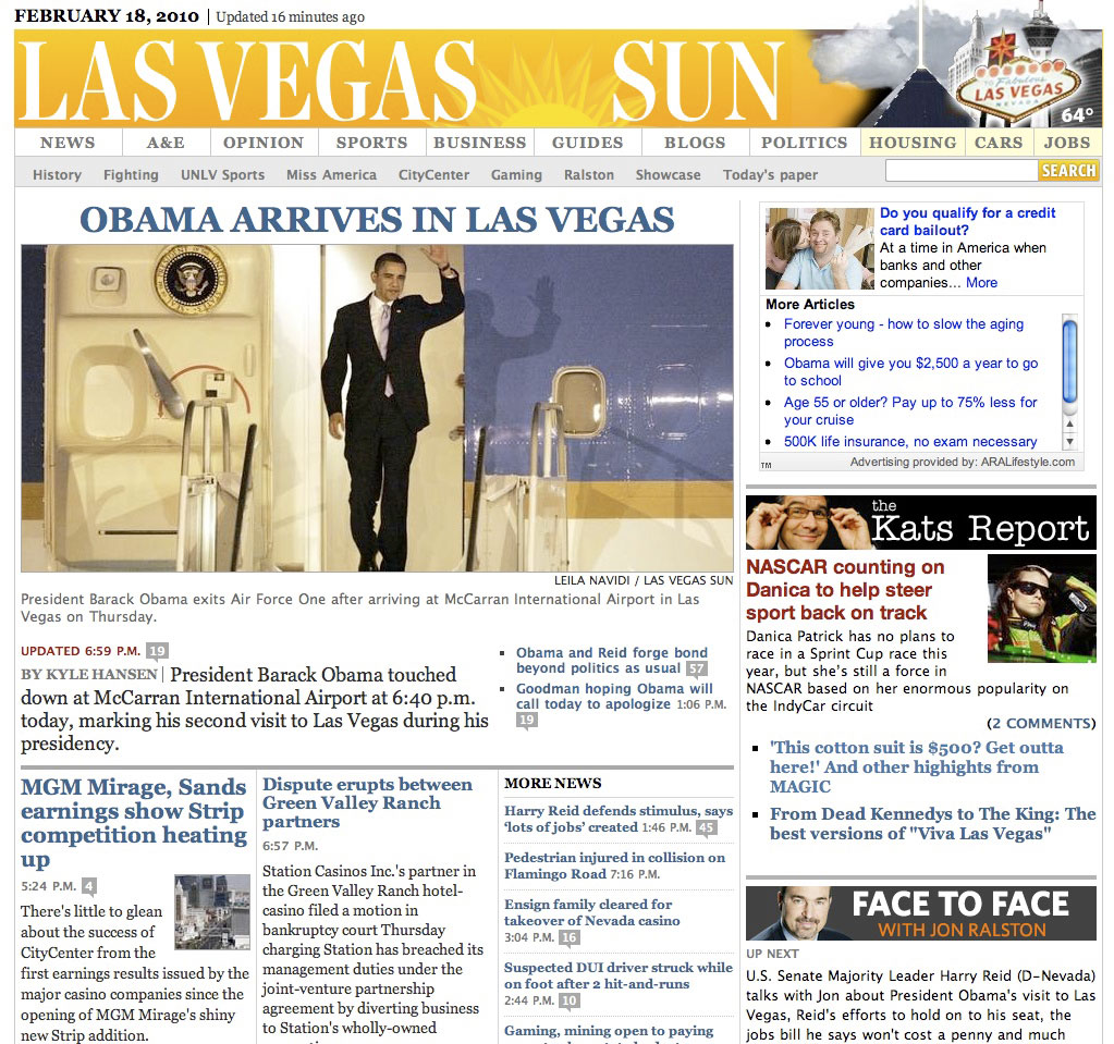
We also have what we call our “holy sh*t” homepage template, which we’ve used only twice since we began changing the homepage design throughout the day. (We started using the multiple-design version of the homepage on Jan. 20.)
+++
So, what does this all mean?
Well, we learned that a pretty and practical homepage design combined with the right content mix has led to the most significant online traffic gains of any site our online team has worked at.
We even learned that changing up the design throughout the day doesn’t hurt traffic, despite some traditional online-news design thinking/perception being that you should always leave everything in the exact same place. (Which, BTW, is the dumbest thing I’ve ever heard. I mean, look at how the design of the front page of a newspaper changes everyday, yet everyone seems to pretty much get that concept. Give your readers some credit. Heck, it might even open their eyes to content they wouldn’t normally view.)
We’ve been doing the multiple designs of the Sun’s homepage throughout the day for about six or seven weeks, and our traffic continues to trend upward, with the most obvious lesson being that a breaking-news story with a killer photo gets a whole helluva lot of pageviews, especially when you have a design that blows both out.
More importantly, we can be much more agile with our design based upon our daily content production.
(Though I should note that we’re really only changing up the main content area of the homepage. The navigation and other core elements of the site are always staying in the same places.)
And we know all of these things because we’ve benchmarked nearly everything from Day One.
Thank you, John Temple for the great advice.
+++
To comment on this post, or to see comments about this post, please go here. (Requires Facebook account.)
